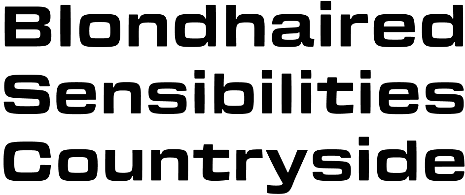
In 2016 I was trying to create type that felt like lettering.

There are characteristics of lettering that are difficult to translate to type. Many lettering-like fonts acheive that description through stylistic alternates or inky texture. My attention was focused on the way lettering appeared to grip the page whereas the smooth, perfectly beziered fonts I created felt floaty and disintegrated. Digital fonts scream “I was put here by graphic design software!”.
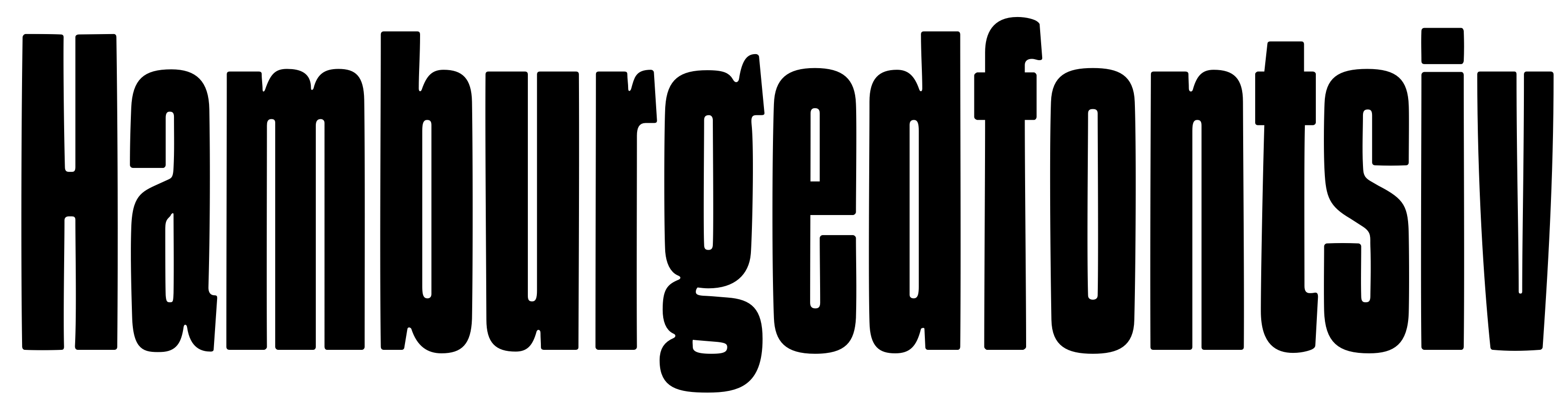
Bezier best practice lead me to uninteresting rounds. I started experimenting with putting nodes on the 45° as well as the extrema. It slowed down my drawing process but had the nice byproduct of forcing me to think less about tension and more about shape.
Gooper, released in 2017, played on similar themes. Its fluid outlines had many more nodes than the average nodes per font. Similar to my explorations in translating lettering, Gooper attempted to bring the warmth of ink bleed into uncannily smooth digital spaces.
Gosh started while I was in that mindset¹. I was prodding at my own inclination toward production and speed. By making making fonts slowly, and convoluted by design, I found myself in new territory.
It isn't unusual for an idea to sit around until good reason forces me to revisit it. What can I say? I'm a pretty lazy guy! So, a couple years passed before I created the first regular proportioned styles of Gosh (to compliment some titles I created for BYUtv's Making Good).
Somewhere between then and now I'd pick up the drawings and make subtle adjustments. I can't really explain the thinking behind those changes at a macro level. But an overarching shift that is hopefully noticable, was in removing some of the stiffness.
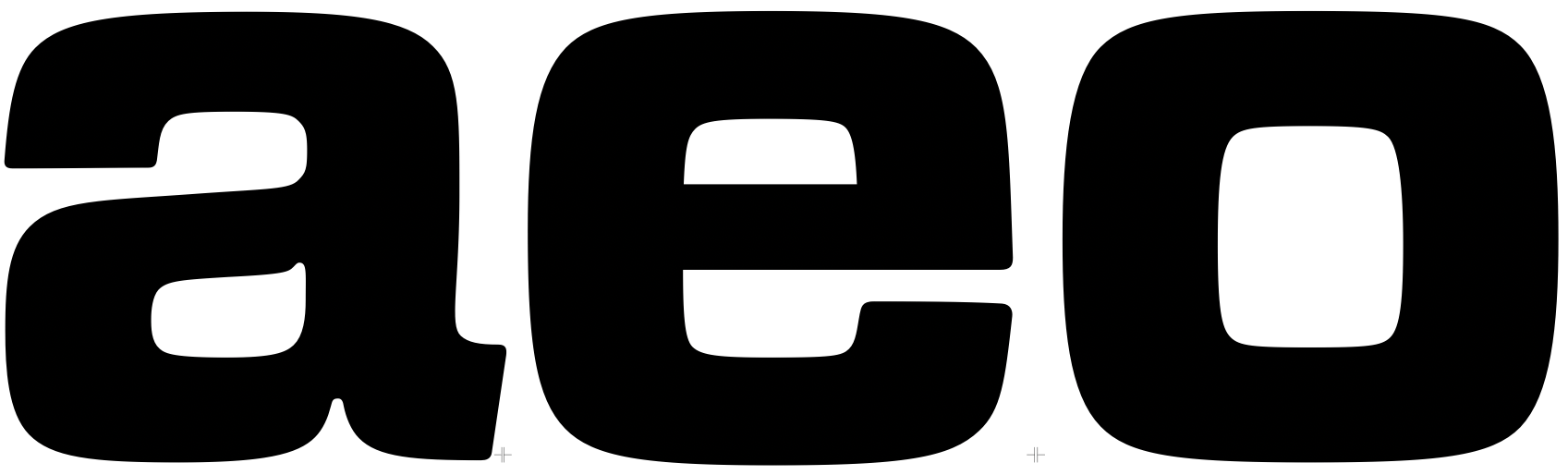
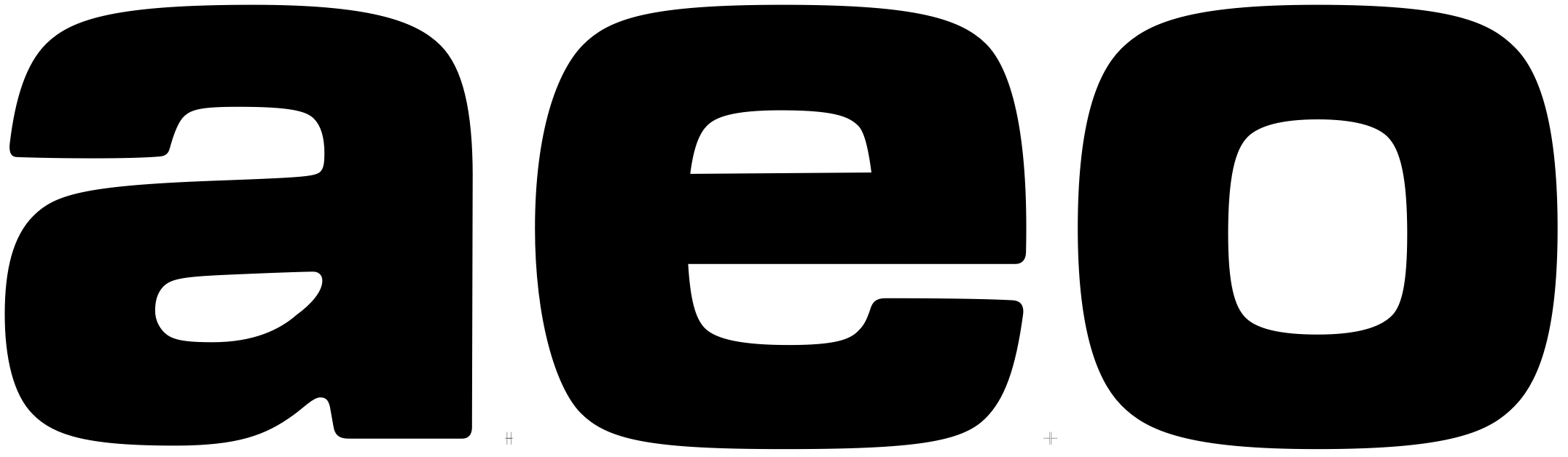
By bringing the 45° nodes inward, more of the letterform could feel curvacious. This shift took a long time for me to wrap my head around, but it feels so obvious within the context of my original goal. Like I mentioned in the marketing: soft corners and bowed lines give the letters a sense of tangible weight.