At a certain point, not being able to ID a typeface is its own sort of pleasure.
There’s an overwhelming calm as the brain’s typographic pattern-recognizers go into overdrive. As they stop their mindless firing for a moment, there’s a gap where you can almost see through the veneers. The letters stand naked, nameless, just the bizarre little assemblages that they are.
When I first saw Matt Yow’s tweet, the tweet that would lead me here, with a common enough ask for a font ID, my chimp brain overcame me as I turned my desk over and pounded the ground and spit loogies at the art on my walls.

It’s like music. At some point, you didn’t know your favorite song existed. Then it was in your ears, the groove was overtaking you, you felt goosebumps, and you asked damn what song is this, and someone told you the name.
And then the face had a name.
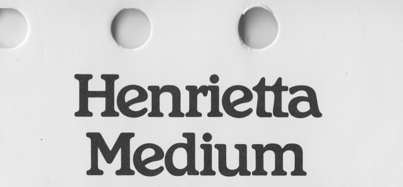
Henrietta.

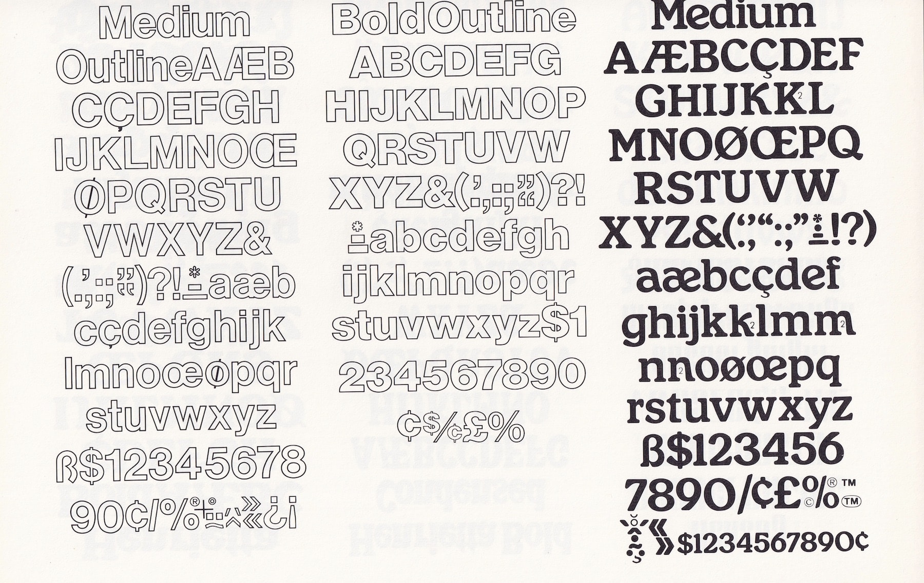
And then, to my surprise, Henrietta was right there in the big dumb books I own (The Solotype Catalog of 4,147 Display Typefaces, 1990’s Homage to the Alphabet: A Typeface Sourcebook). And then kind people are sending me more proof. Florian Hardwig sent some from Phil’s Photo, 1980. Stephen Coles found the full alphabet, with alternates, in a Rand Typography specimen and Andresen Typographics.
Henrietta was (probably) designed in the 1980s. It’s (probably) a Souvenir rip-off, but a rip-off with its own underlying logic. Henrietta has defined departures from that ubiquitous soft serif queen and just about everything else in the genre. It has a flatness that keeps it from being an oldstyle, a warble that feels more Art Nouveau than it does Arts and Crafts, a tall x-height, thick terminals, low contrast, with a lot of the diagonality of Windsor in the lowercase. In every in-use I found, the letters are spaced tightly. It wasn’t half-baked. Henrietta was a completed work. It’s a type family that shot for the zeitgeist and apparently, missed. Which makes it all the more strange to find that big distributors clearly thought it would (probably) sell.
Henrietta is in many of the big sources, but it isn’t really in the world.
But how? A morsel of sellable intellectual property doesn’t just fall by the wayside. In capitalism, nothing goes unclaimed! And yet, in all these sources, there isn’t a credit. No owner, no creator, no foundry, no manufacturer.

Some rip-offs are famous, some are quietly noticed, most designs qualify as a rip-off in some respect. With fonts, what looks like a brazen attempt to recreate an existing work for commercial interests usually is one. The big rip-offs, the Arials to your Helvetica, the Inter to your San Francisco, aren’t opinionated. With these works, any clear differentiation jeopardizes the rip-and-replace potential that makes the design appealing in the first place. Henrietta was trying for something. What stood out to me about it, made it worth reviving, is that it’s an opinionated rip-off.
There are these rumors, in the type community, these hypothetical scenarios where a judge has to decide if a font’s design has been infringed. Some say the code of the font is compared—the numbers, the ones and zeros, are what gets scrutinized. It’s a math equation. And, certainly, there’s no math to be compared here. Henrietta hasn’t been digitized before.
But there’s those who say it’s the drawings—a pdf print out, a dozen “quick brown fox jumps” are passed between a blind ol‘ judge and a clueless jury. Justice is made by the layman’s eye. In this setup, I’m not sure where Henrietta stands.
Somewhere in all of this, it’s October, I’m redrawing Henrietta, my partner Emily and I have friends over to watch The Shining. Someone comments on the titles, speaking covertly to me, “what do you think of this font?” They say unknowingly of Helvetica, “seems modern, out of place, for the 70s.”
Around that time, while I was mindlessly smoothing out beziers and resizing corner components, the surface of the calm lake of my mind was sometimes disturbed by the image of my future self writing this post. Why am I doing this, I would wonder, as I noticed another bit of loogie crusted to the wall. How will I ever explain a revival that, to many, looks exactly like the several soft serif fonts I still haven’t finished?
I certainly have my own opinions. I think Henrietta should be a workable digital font. I think it should exist in the world. And, I think I'm the guy to do it. I have a little practice in this territory. I asserted those opinions in the act of reviving it. What more can be said?

But there’s something in this that feels insidious, something “every man for himself”, about the whole thing. Something I wish I could explain.
Here I was, October 11th, at my desk in Oakland, minding my own, bemusing myself on the museum of culture (Twitter), when I discovered a rare bird feather from an extinct animal. So I take it, simply because there is no direct consequence and my intuition tells me to. The guards are asleep and the curators long ago forgot there even were birds in the museum. The buyers are stoked on the feathers and not all that interested in where they came from. Win, win, win, win, win! (Oh, this is a real thing.)
Souvenir, a pigeon (for our purposes), first came out in 1914. It was marketed for its forgiving qualities on press. Benton never saw its success in his lifetime. Its hey-day came much later, in the 1970s, when Ed Benguiat re-drew it for Photo-Lettering.
“Due to its enormous popularity in the 1970s, Souvenir has become associated with the design of that era. This inevitably led to a backlash commencing in the 1980s and 1990s. Simon Garfield lists it as the ‘seventh worst typeface in the world.’”
Right this very decade, one-hundred healthy years after Souvenir’s release, soft designs are having a moment. Anyone on Instagram knows this. And, as Proof&Co kindly noted, “Henrietta exhibits a disarming and jovial flair (...) that will surely find a wide audience in today’s graphic design climate.”
I wasn’t exactly sure how I’d feel on the other side of the release. Part of me thought the ethics of the thing would resolve when the release flopped. After all, Henrietta had one fruitless release to its name. I wondered if Henrietta lacked some important detail—a detail that Souvenir had, which kept it in the upper echelon of font sales, made it worth reviving by the likes of Benguiat.
Or maybe, like Souvenir, the creators of Henrietta took a strange marketing approach.
Or maybe (probably) Henrietta was released during the Souvenir blowback of 1970-2010.
I don’t believe we amount to much, as individuals, when it comes to the sum total of our unique contributions. This feels especially so with fonts. We can hardly understand how these symbols came to exist, let alone take credit for their tiny evolutions. I guess I’d like to see Henrietta have a little bit of a moment. No sense in letting a good set of curves go to waste. Somebody put time into it. And then...I put a little time into it. Hopefully...you’ll put some time into it. Together, with our unique contributions combined, we’ve (probably) got a good shot at making something, at the least, opinionated.