For the last couple years I've sent out painted mailers filled with stickers and patches with every font order that comes through this website. It's part marketing and part forced brush practice. During a few high traffic weeks, I noticed myself gravitating toward a single stroke/script hybrid¹. It came out pretty organically, and soon began working its way into other projects.
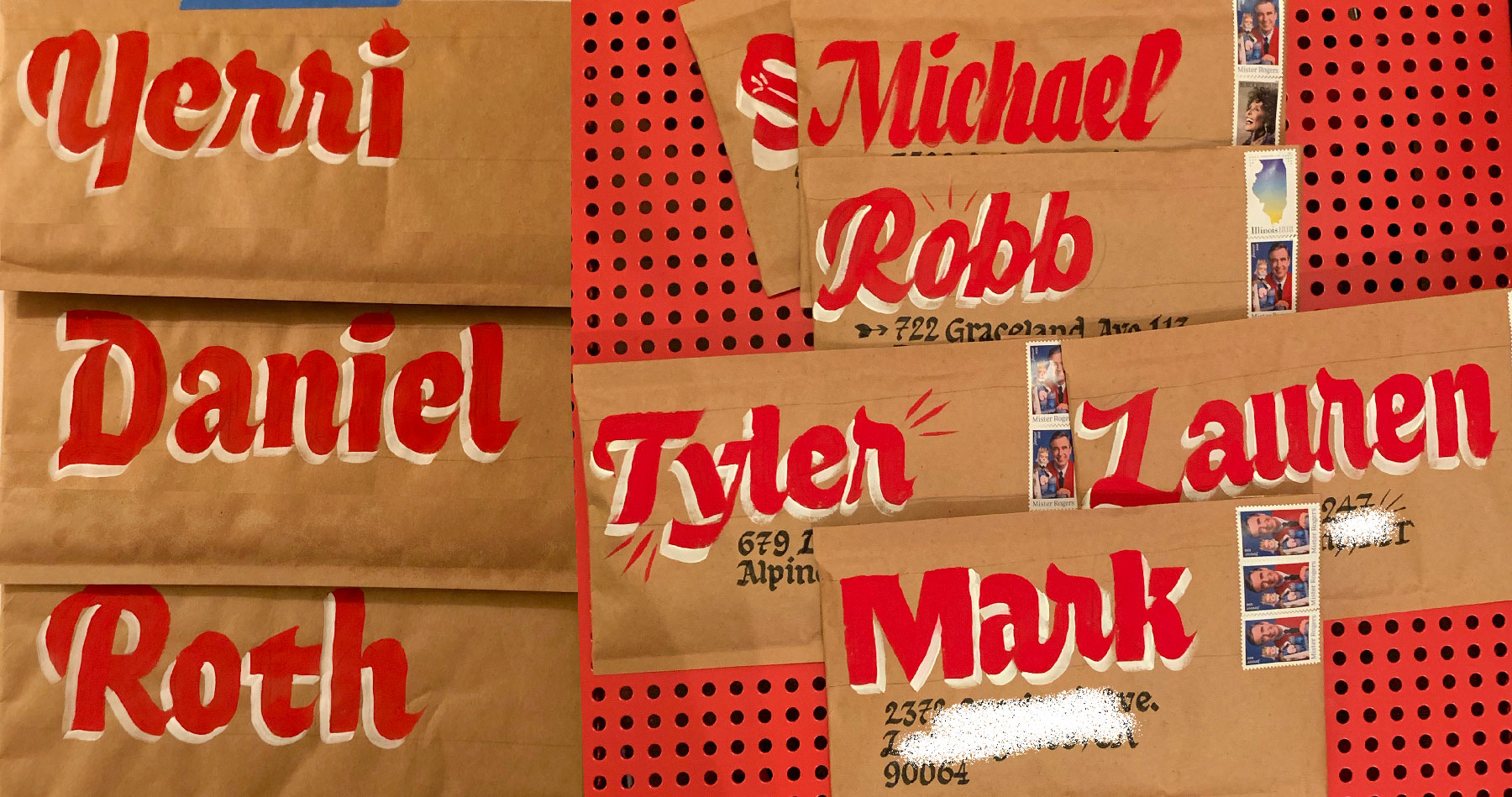
Eventually that hand painted stuff started showing up often enough that it merited creating a typeface.
Letter construction
Early on, some of Bruphy's drawings weren't constructed the way I was constructing them with a brush. They were more like outlines of letters than brush strokes. Creating a ductus with a brush is much hard! The brush can twist and turn in good and very bad ways. Without thinking about it too hard, eventually I found myself settling into a drawing groove that was half ductus and half whatever I wanted. The alphabet is constructed using a few key brush shapes, and then modified in "true to the brush" ways depending on placement and <em>my emotions</em>.
Bruphy is my first commercially released variable font! An interesting <em>feature</em> of variable fonts is the way they preserve the shapes that you use to make up each letter. Typically, to reduce file size, a non-variable font will remove overlaps and unify paths on export. Sometime back a few years ago, Animography did some test samples of turning Kansas Casual into an After Effects font. Going through that process opened my eyes to the idea that there might be benefits in not removing overlap, and allowing end users access to the shapes that construct a letter.
I did a few tests with slight rounding on the corners (my thoughts on this for Kansas Casual), but decided not to go that direction for V1. I'm not writing it off entirely, I just want to make sure I'm going about it in a considered way.
Why did it take two years?
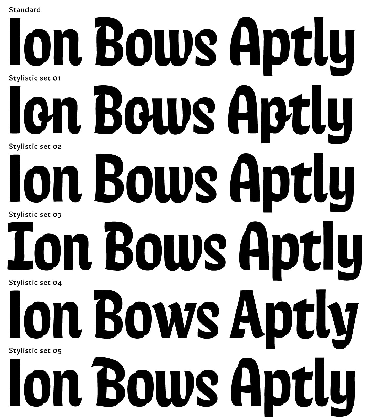
I have loved having Gooper up on Future Fonts. It has been one of the highlights of my career in type. Getting feedback, and bringing ya'll along for the ride has been incredibly fun. That said, that process still hasn't helped me figuring out what a good V0.1 looks like. I seem to lack the skill of knowing what will be useful in a font, and need to use it for several projects before I notice what it needs. The only way I've been able to release Bruphy is by baking all that indecision into stylistic sets. The twisting and turning of brush lettering can produce so many variations in the same style — I couldn't choose just one!
Blue sky future plans for Bruphy
- Some serious style styles: drop shadows, decorative inline elements, etc.
- Italic! Script! Maybe these are obvious from the paintings above. The upright style came long after some of the more traditional, scripty, forms.
- After Effects animated versions?
- Variable font rounded corners?