Gooper was drawn in adoration of goopy, swashy, fat faced, tight and touching old style serifs. It sits as a companion to Cooper, Bookman, and dry transfer/photo lettered era display type. This post is a little behind the scenes provided mostly to clarify my intentions to a community that has a long history of rip-offs, homages and revivals.
Cooper Black is remembered for its warmth, not for its old style skeleton. I like to imagine that Cooper was conceived (hang on¹, let me go read the wikipedia) after Oswald Cooper had the experience of seeing an ugly sign improve as he stepped backward from it.

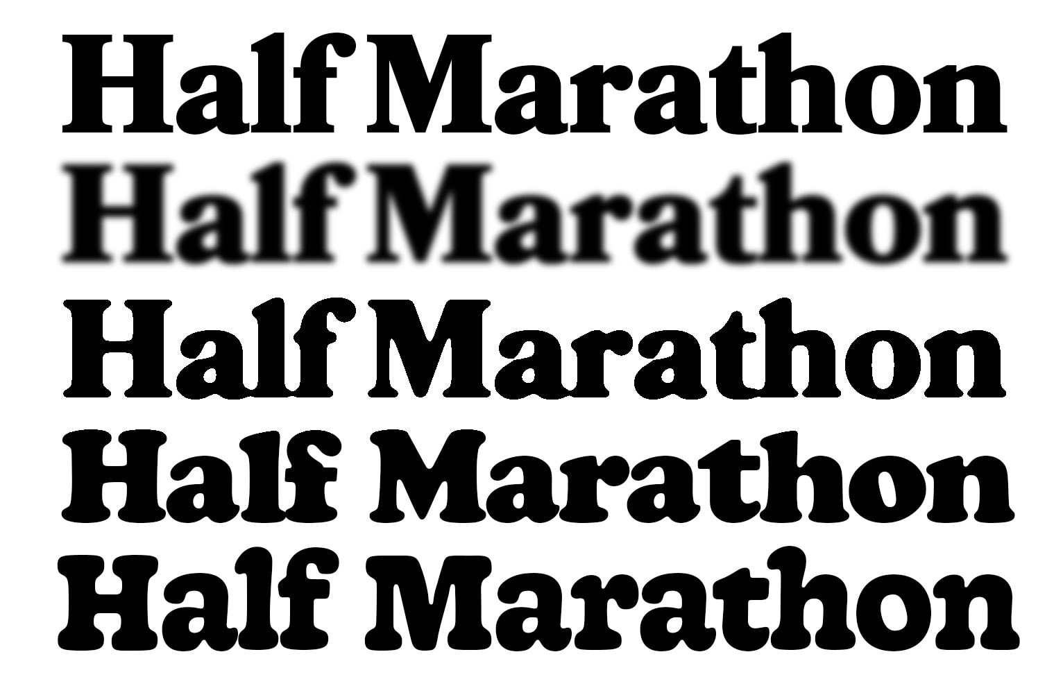
Cooper (let’s admit we’re mostly talking about Cooper Black here) has an impressively consistent goopiness. Where usually an ornamental decision like goopiness or roundness feels like a secondary feature, Cooper's goopiness creates a rhythm so consistent that it sets the pace in the same way stem thickness or curve tension can. It's so fixed that you might imagine Cooper was made with a specific writing tool. And there kind of is precedent for goopy letters made with goopy tools: round nibs (commonly used for smaller uppercase lettering on show cards), painted letters made with sub 1/4” single stroke quills, or even the mysterious universe of turn of the century goopy fat faces. These fat faces feel like the obvious inspiration and provide a less apocryphal explanation for Oswald's masterpiece.
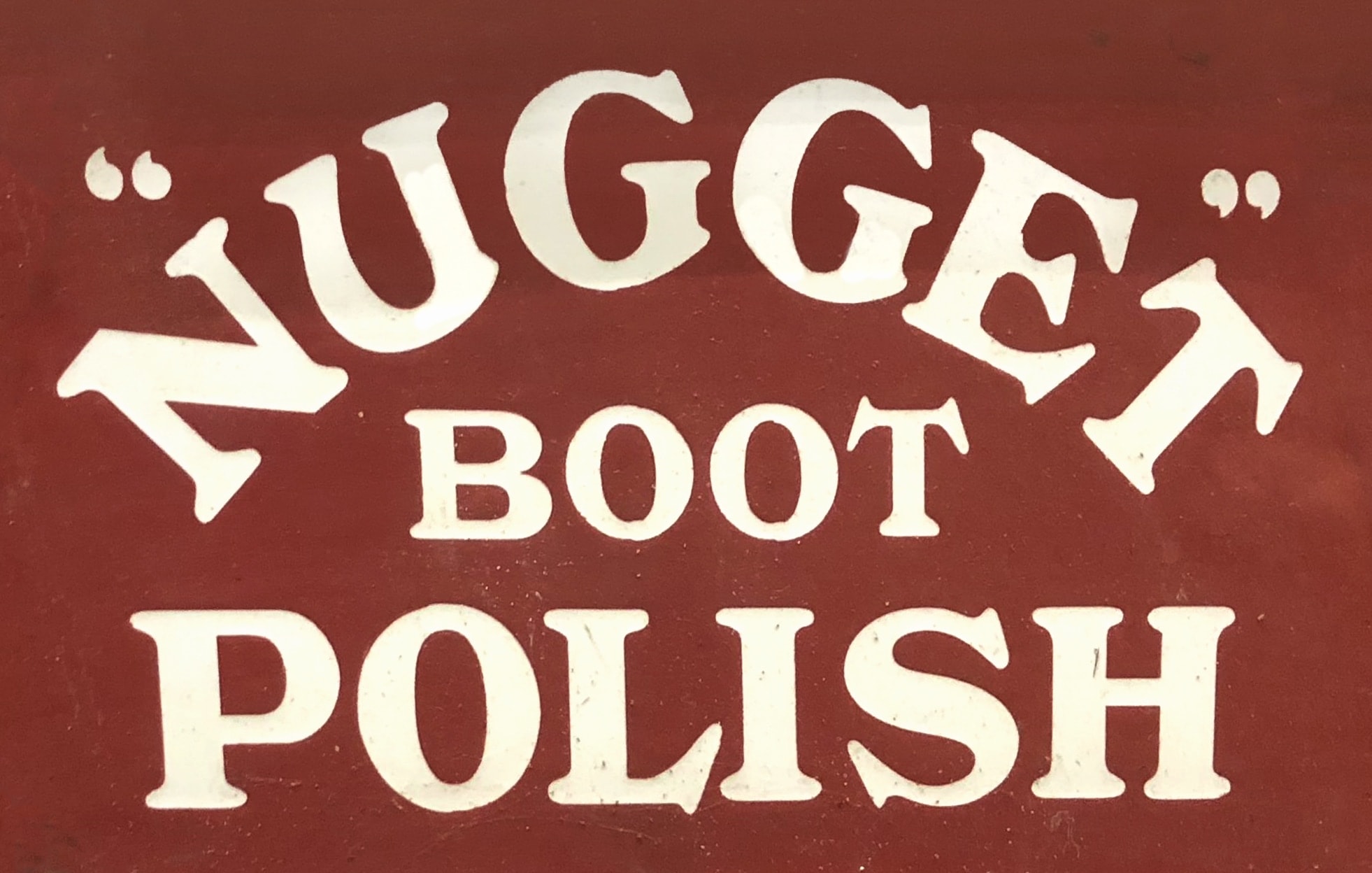

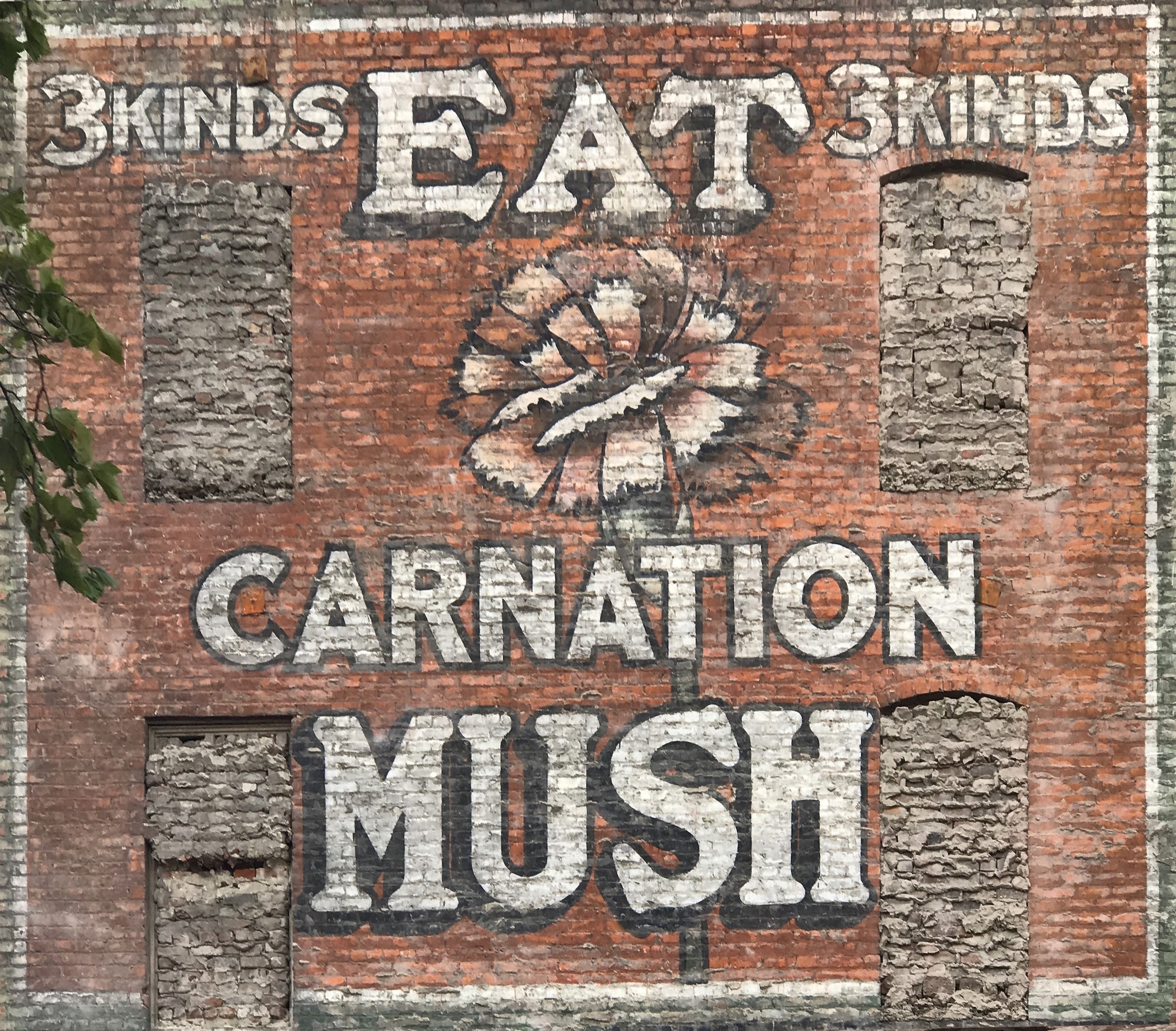
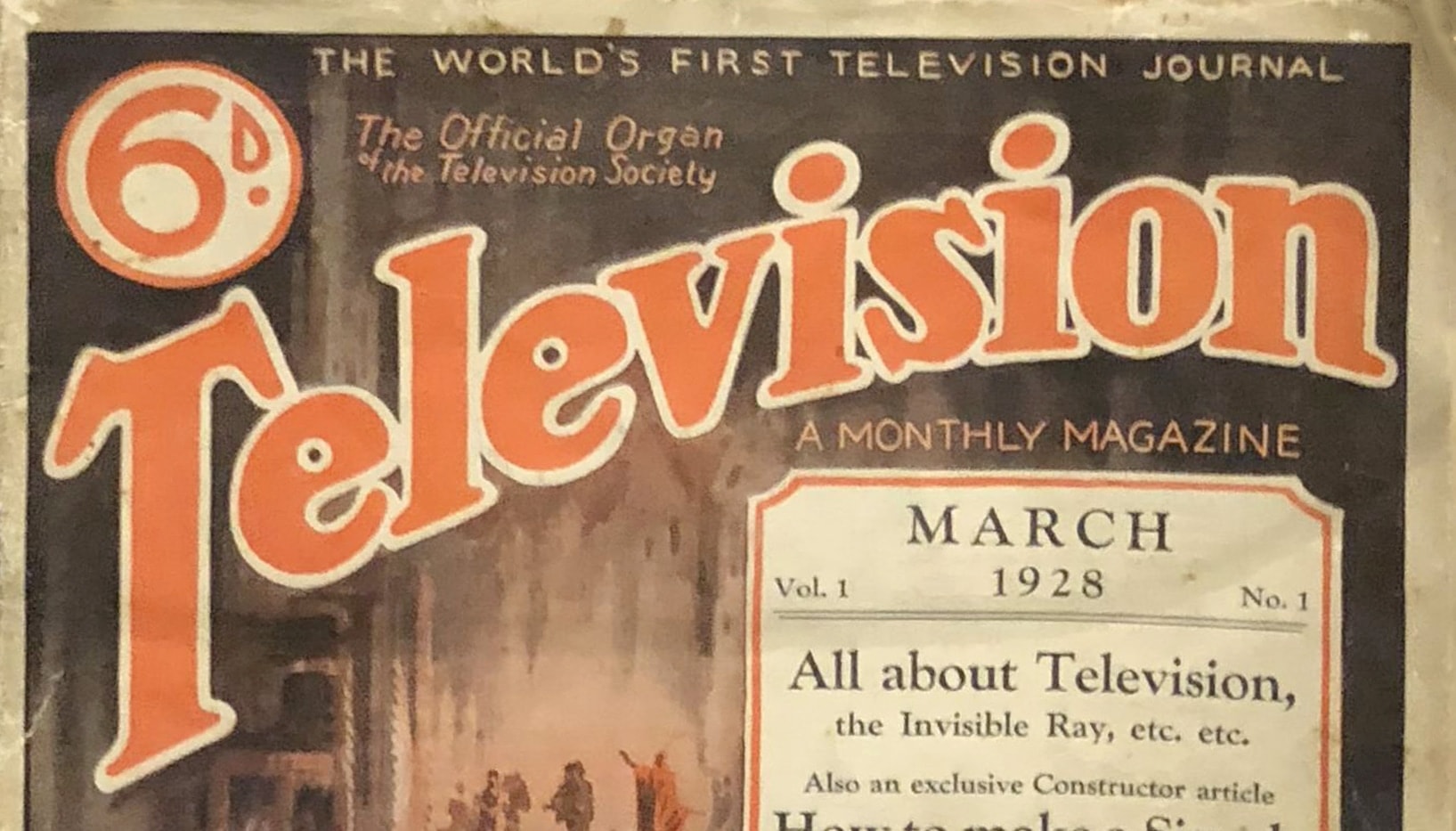
With the release of Fontstand, we the proletariat (I) finally had access to display type that we (I) had always wanted to try before buy. I rented Cooper Nouveau for a quick title for my girlfriend Emily’s youtube videos (don’t tell her, she still thinks they were hand lettered). While I'm still pretty unfamiliar with the universe² of photo and dry transfer type, using and exploring the Plinc library helped me better understand their motives. Cooper Nouveau shared that rhythmic goopiness with Cooper, but little to nothing else. In stride with other type of that era, it banked on the popularity of the name and then added some swashes. Otherwise their contrast, width, weight balance, and even the amount of goopiness was entirely different. And while they are so different, they still make good bedfellows in that under-explored corner of goopy fonts.
It's worth pointing out here that (goopy universe aside) Cooper exists within its own subcategory of myriad ripoffs and Cooperish letter products. Iron on lettering, wood bead alphabets, fridge magnet alphabets, and children's foam letters all flesh out the public experience of "Cooper".
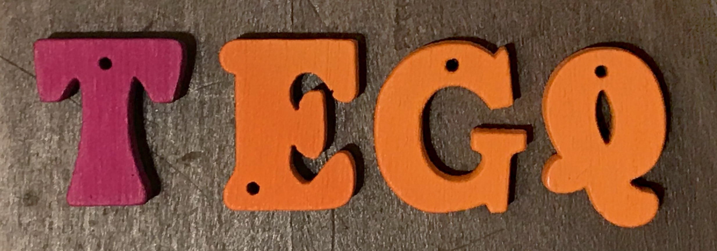
Lexicon and the name Gooper
Typographic lexicon is so damn underdeveloped, making it difficult to describe function and aesthetics without simply drawing comparisons to other existing type. Shall I compare thee to a summer's font? Ugh, please forget that joke already. With the recent resurgence in popularity of goop, I’ve seen a few foundries³ struggle to find the words to describe it with their release.
I'm not proposing that goop or goopiness is a good typographic description. I am similarly not proposing cooperish is a good pattern we've set for describing things. I'm mostly just shrugging and trying to point out that our own (my own) inability to invent typographic diction is keeping us from non-derivative progress.
Drawing
Most my type projects start as lettering. I'm not super methodical early on, and tend to draw just one letter at a time as needed. Gooper's earliest drawings were in January 2017 with the title for a half marathon I host with my friends and family each summer.
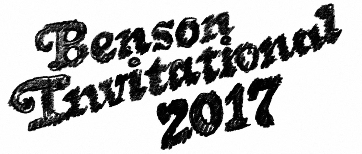
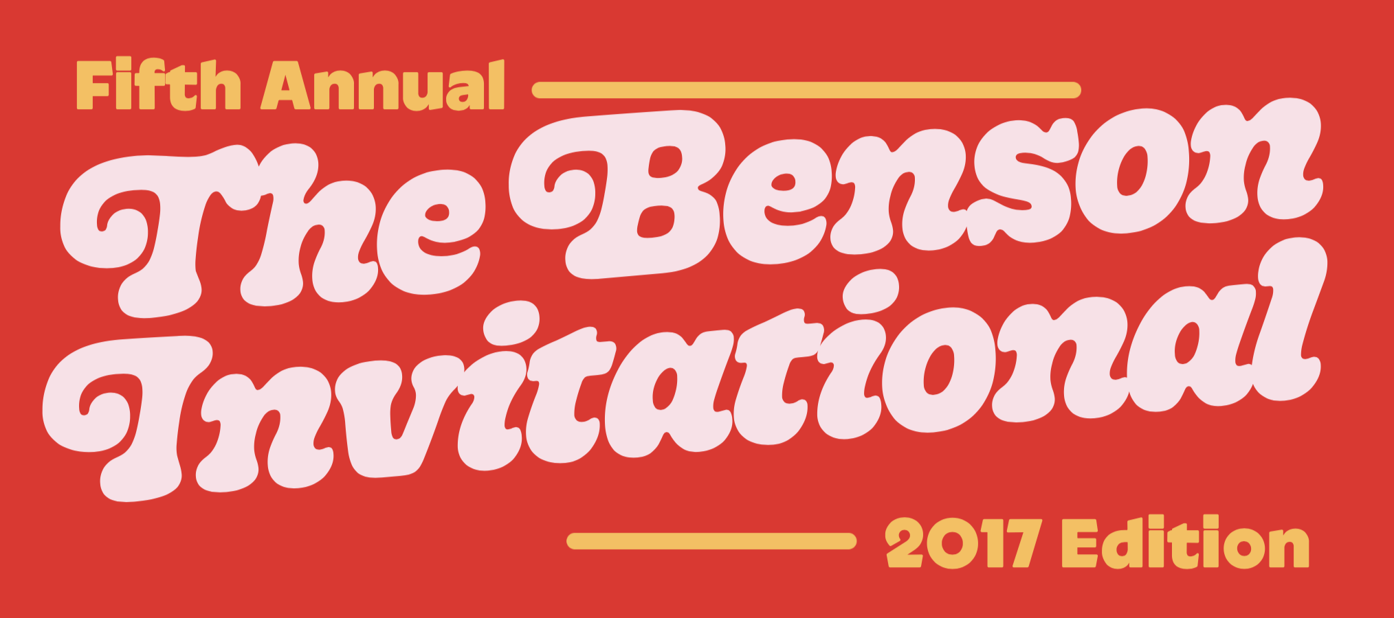
I don't have very many interesting things to say about the drawing process. It challenged a lot of my correct vector drawing assumptions, and reaffirmed my love for Glyphs’ Fit Curve tool.
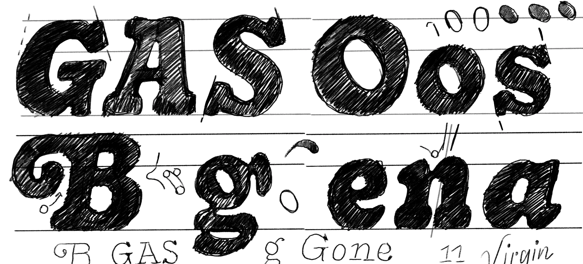
Drawing the light master
For better or worse, my current process when drawing type is to draw⁴ both extreme masters simultaneously. The light master quickly presented some interpolation challenges that I haven't fully been able to solve—and are keeping me from creating a non-glitchy variable font version of the family. The drawings in the light weight violate a lot of the interpolation/rendering rules, while still creating the intermediate drawings that I want. To this I have to offer: ヽ(。_°)ノ.
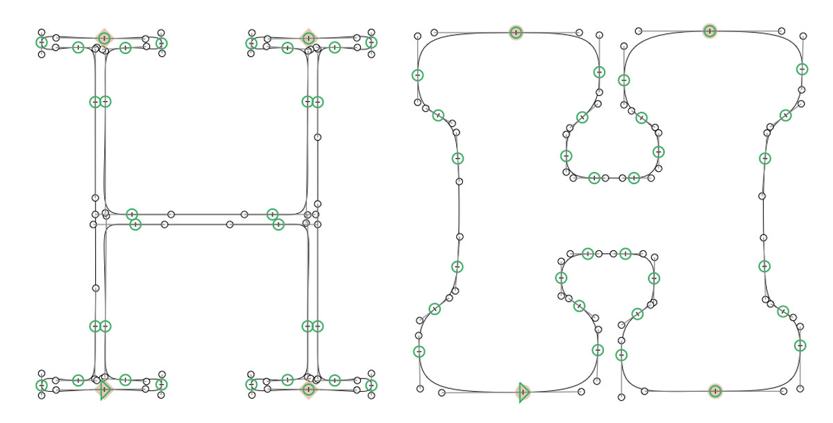
Stylistically, thin type can only do so much. It's always gonna look more chic than you'd like, and has problems to be solved that are 100% caused by the black master. Gooper thin falls somewhere between mono-width pen lettering and a typewriter font—which I think says more about thin styles than it does about Gooper.
As of V0.1 the middle three weights are 100% interpolated. It's my first time releasing a font with only two masters. Contrast and stress can get a little boring in the lighter weights when you use interpolation to produce your middle font instances. Usually I generate a regular weight via interpolation, then tweak it as a new middle master. Gooper's extreme differences between light and black provided an interesting challenge for generating non-janky middle interpolations.

Future Fonts and Beyond
My ambition for Gooper is that it is a compliment to and not a replacement for Cooper or Bookman. It should fit in the same toolkit, not replace an existing tool. I'm hopeful that releasing Gooper on Future Fonts will help me understand where this kind of retro-ist font sits in design today. My intention was not to create a competitor, or cheaper and slightly altered Cooper. Like most of you my taste is burdened by nostalgia, which means invariably the old and vernacular escape rationalization for why I love them. They weave into my work and become something undifferentiated from creations that are distinctly mine. If you think Gooper is neat, if you buy it and use it, or if you hate it—I would love nothing more than that feedback. I'm handing the creative reigns of Gooper to the world. Provided that you've read everything before this, hopefully you can help me understand what our old pay Goopy is asking for in V0.2.