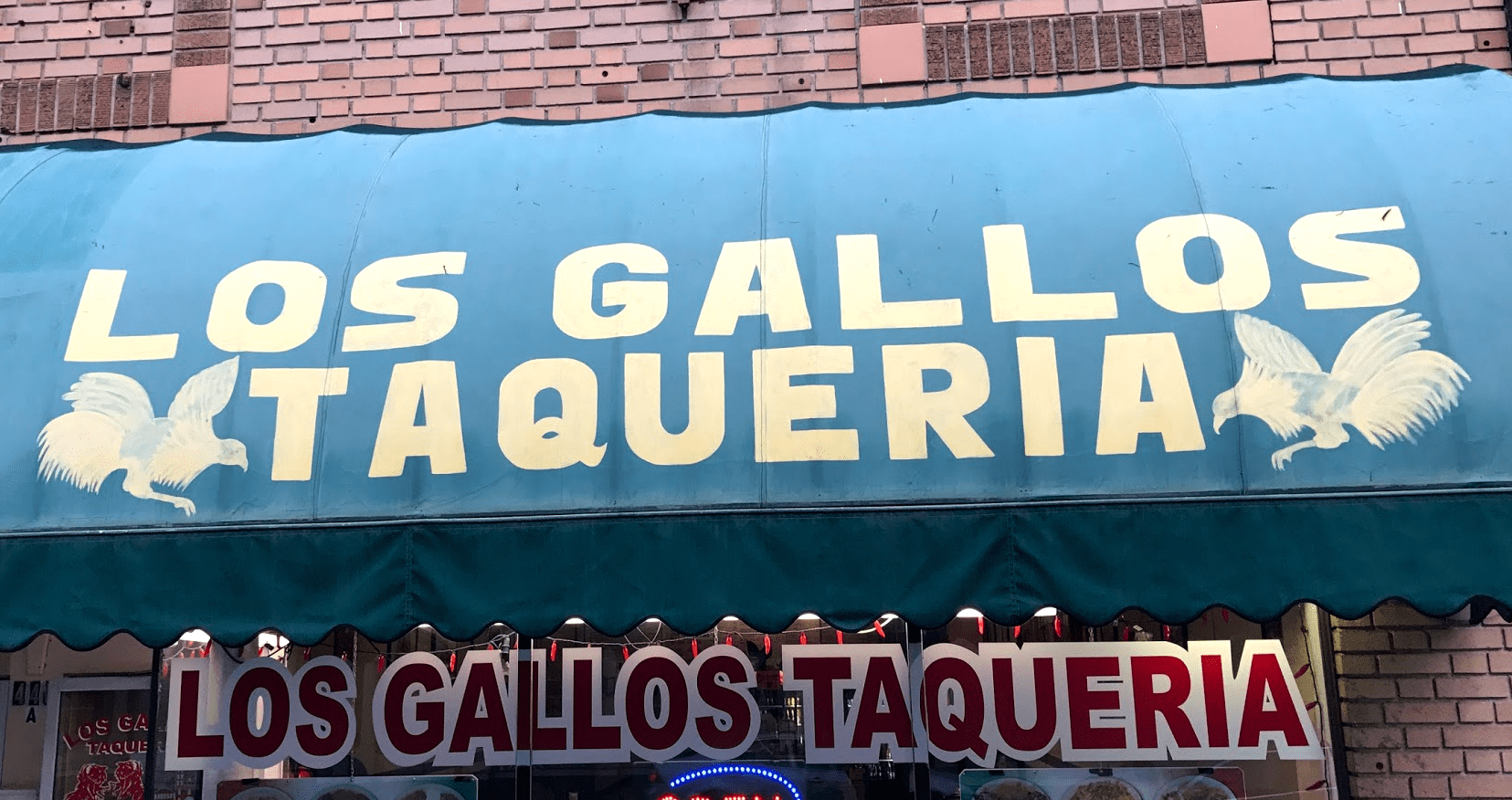
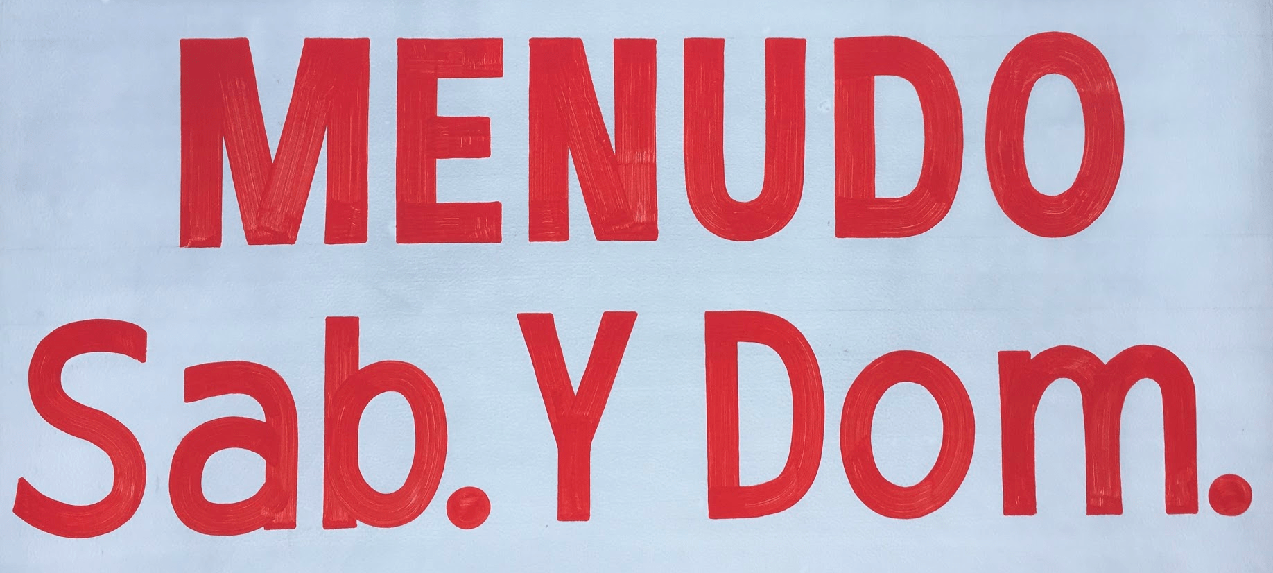
When I was in college, I worked as a layout designer for the school newspaper. I was then and am still now impressed with how many tasks are put on the shoulders of a single compressed font in news design. It must fit into a tight space, be readable, convey a huge variety of emotions from urgency to devastation to compassion all while gaining the interest of a reader and maintaining the brand of the newspaper.
Many of the great titling typefaces are grotesques, like: FB Titling Gothic, or Bureau Grot. Which is pretty cool, considering the style's history. Grotesques, the original sans serif ¹, got their funny name because the public found them ugly. Their designs were far outside the expectations of how a letter should. It's a bit hard to comprehend, given the contemporary view on sans-serifs as the default choice of companies everywhere, from prudent tech companies to big ol' newspapers.
A few of the in-house companies I've worked for used Tungsten for headlines. It’s a great type family. Even the most reckless typesetter would have a hard time creating an ugly headline with it. When was it that sans serifs had transitioned from duckling to swan?
Erik Van Blokland's type family Action, has this little blip in its description that caught my attention: ”Its casual personality and quirky shapes give a friendliness that is unusual in a straight-sided condensed sans.” And he's right! My goal with Cardinal has been a similar one: to stop myself from sanding the design down before I've left it sanitized and neutral looking. I wanted to design a sans that felt casual.
Here are a few of the questions I was asking myself from the outset:
- Are we at peak recognizability with sans-serifs?
- Have they found themselves in such common use, that any subtle variation will appear to be eccentric and exciting in the landscape of monolinear geometrics? see also: James Edmondson's recent talk on this.
- How are modern tools preventing me from creative solutions to problems? If I work with a brush, will I solve problems differently?
The long tail of development
In some ways, Cardinal is the first font family I drew. The regular width shares a lot in common with Clayton, my second KWB release back in 2010.
I received feedback on Clayton then, that underpinned a lot of those more recent thesis questions. That feedback was something like, ”This looks like another ATF titling rip off. Does the world really need another one of those?” The question, “do we need another new font,” is not new, but the question, “do we need another condensed font,” made me wonder: can all the problems in one small part of type design be solved? Once they're solved, has the style by that point become too boring to be revisited?
Yes, we need new fonts, but are we sure we need new condensed neo-grotesques?
Careful beta-testing ² was the process that helped me answer that question. About a year before releasing it I sent it to many designers, and received a good deal of feedback that I wasn't expecting. At the time of that first beta release, it only had 3 widths at 8 weights each (all condensed). Feedback from those using it insisted that a wider width, rather than italics, should be where I spend my time.
Spacing
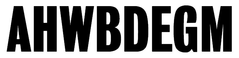
Fitting traditionally wide letters into a spaces one quarter or one eighth their standard size requires some problem solving and convention breaking. Each of the various letter trades solve this problem differently. With a condensed face, type designers will often cut away from the positive space of letters like M and W in order to fit every condensed letter within a relatively common width. Painters, perhaps because of the physicality of their tools, will care less about width and allow the letter proportions to flex in order to maintained a relatively common stem width.
Interpolating
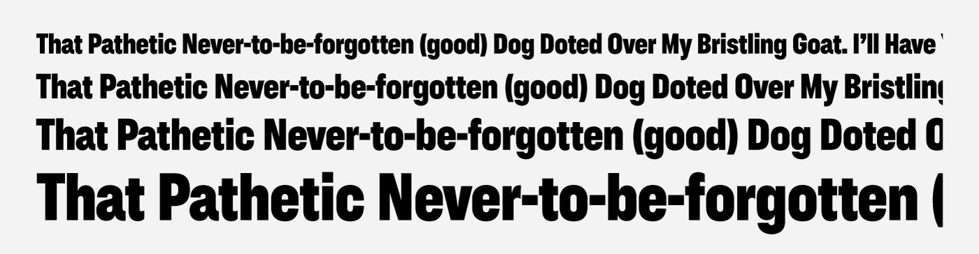
The contemporary process for creating font weights is called interpolation. You draw a super bold weight, then you draw a super light weight, and then you ask the computer to do everything else. The problem with that process is that designs that really compliment each other do not always share similar structure in the way interpolation software needs them to. I've always felt like there's a digital watermark that comes with a font family built using entirely compatible masters—a sort of digital patina that takes a lot of extra work to clean off.

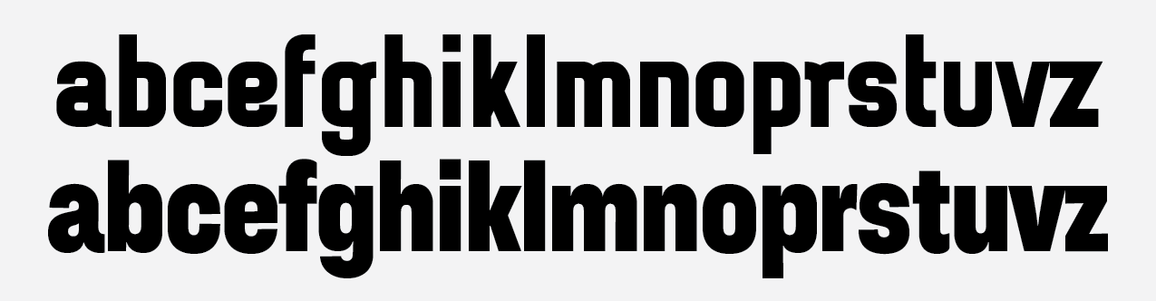
The styles for any particular glyph of Cardinal can vary pretty widely from weight to weight and width to width. This meant creating drawings that could not always use masters to generate weight instances. In order to dance in the way I thought it needed, Cardinal, the 41 font family, ended up with 10 masters and some 100 odd intermediate masters.
Testing while developing
I build this site in tandem with Cardinal. I'd export new web-fonts as I went along. This helped me see needs in the fonts in ways I hadn’t before. Front end development has layout limitations that Adobe products do not. You can't just add a stroke to slightly beef up a weight, or easily kern a specific letter in web development. Because of these limitations, I ended up adding weights, extra stylistic features, and tabular figures.
Optical sizing
It’s getting harder to prepare for every use that a font will have. The tools for building flexible fonts are getting better, but not quite at the necessary rate. While I admire those that put in the extra sweat to create optical sizes to ensure ideal appearance of their type, I'm left wondering how many people use those sizes. Only operating systems currently support automatic optical sizes, leaving the user to make the switch as needed. And variable fonts still miles away.
So rather than fuss about with it, I set all my proofs to a mid range, between 16pt and 40pt. This gives it just a little bit extra of flexibility but it mostly shines there and larger. I won't bullshit you and say it ”works in display and text”. It mostly works in Display and kinda works a little bit smaller. Condensed and Extra Condensed widths really really really don't work smaller than 30pt.

Conclusion
I think I lost track of my thesis somewhere. I'm bad at conclusions. I guess this is all to say: I'm proud of Cardinal because the process informed the outcome. I really do believe it fits into a place in grotesques that hasn’t been explored: it’s friendly, it’s useful, and it’s professional.