It was 2013, and I was on the hunt for a headline font while doing a rebrand for Banzai. At that time they were using hand-written, ink textured and grungy, stuff. To appeal to their teenage demographic, I wanted to find something that felt youthful in that same way but just a little more contemporary. Those grungy hand written fonts came off just as friendly and inviting as they did outdated. And well, teens, teens prefer things that are in-dated.

After some testing, Eckhardt Poster Brush, Suti, and House Slant were all in the running as the replacement. They were all sign painter inspired fonts¹, which paired just as well with the brand messaging, and felt human in the same way a handwritten font might. Eventually we opted to create something custom for the brand. There were a few reasons we decided that:
- The slant (on Suti and House) of about 15 degrees was too intense to be used regularly in headlines.
- Eckhardt felt too juvenile, and was spaced a little too carelessly
- Each lacked a variety of styles
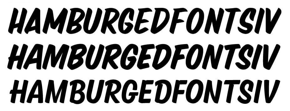
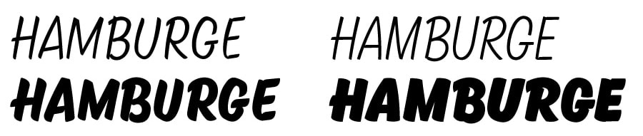
Kansas Casual set out to solve or avoid some of those problems: slant at a more modest 10 degrees, more gothic proportions (like Eckhardt), and more weights for wider brand use in both print and web.
Early Versions and Tests
My experience with sign painting at that time was very superficial. A year before I had bought Colt Bowden's zines and some Mack squirrel hair lettering quills and a couple cans of 1-shot. A few times a week I jabbed the brush and paint into white butcher paper—praying some magic beatific force would (in kindness) intervene. Even though I wasn't very good, I tried to make the brush an essential part of the decisions I made with Kansas Casual. I also tried to sketch out ideas using a brush pen. But the broad splay of a quill or a Robert Simmons One Stroke and the narrow tip of a Japanese brush pen really don't share that much in common.
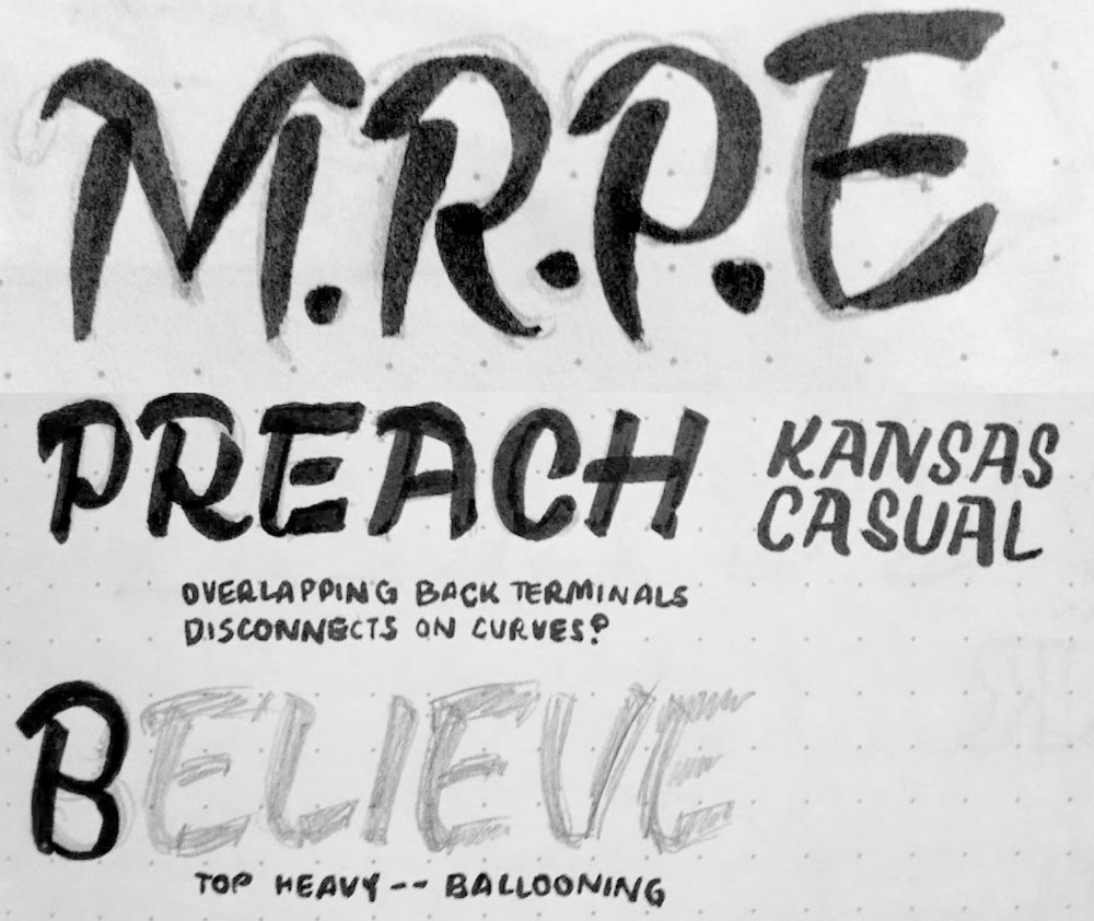
The first digital draft had some pretty elaborate node placement for displaying letters like /S/. I felt like that complicated vector design created the boxy, non geometric, look that I wanted. However, when scaled them down those complex drawings got pretty wonky. The final drawings had more subtle curves and fewer nodes.
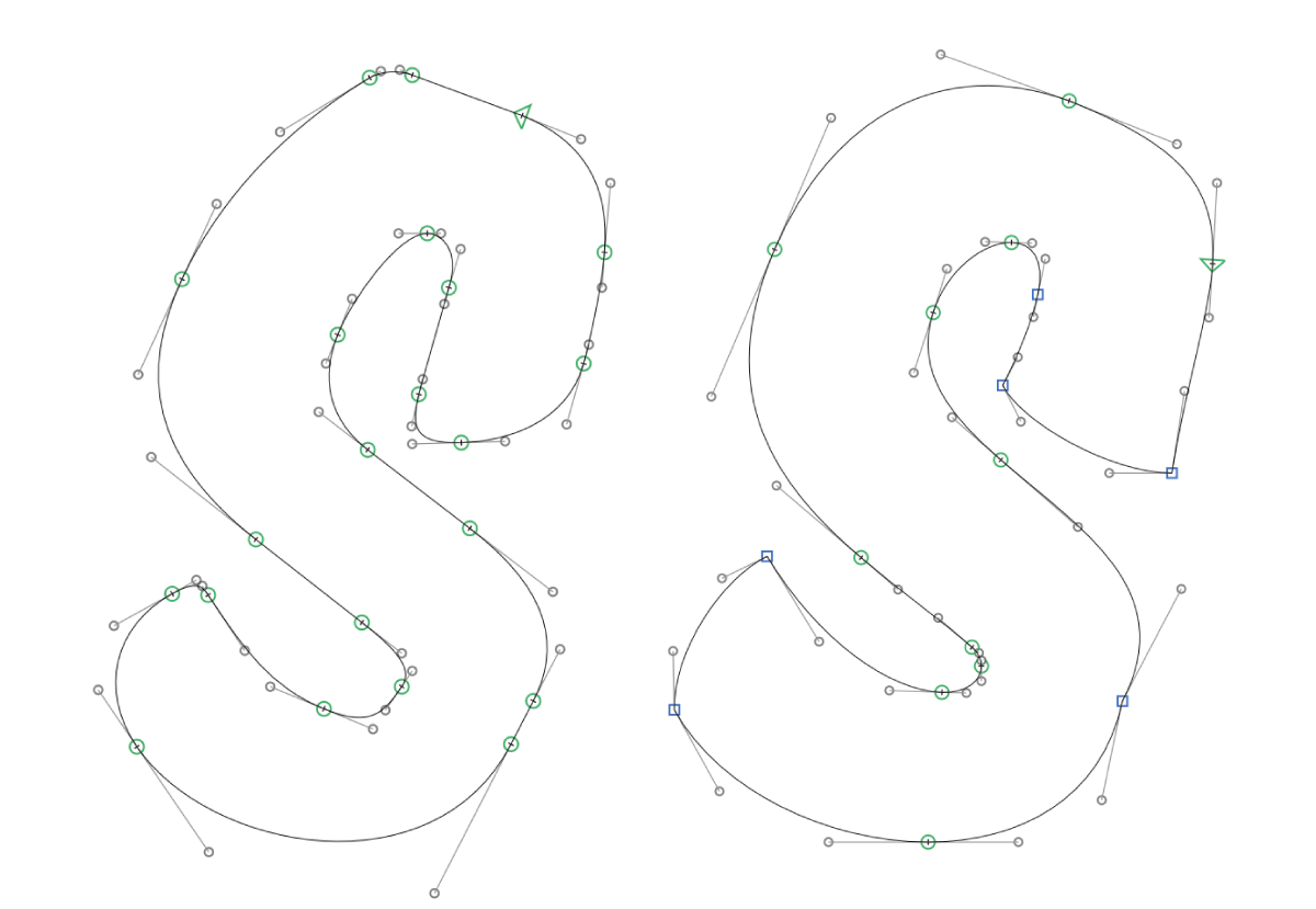
Keeping the brush at the core of decisions meant taking the proofs out to the garage and putting paint to canvas to see if the vector forms felt as natural when painted. That process lead to more research on the one-stroke script, which improved my painting, and in turn improved the digital decisions. This push and pull lead to major revisions by the time it was first released for commercial licensing in 2014.
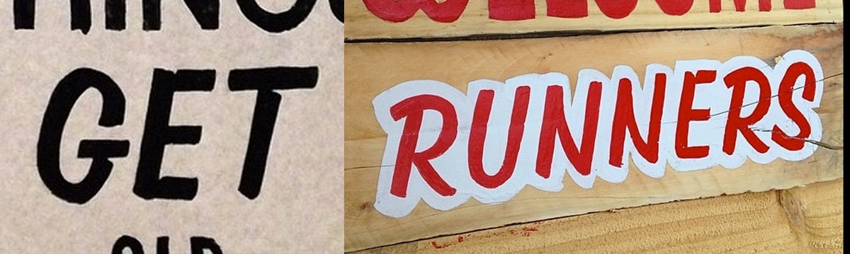
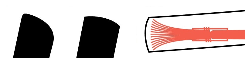
One of the changes that came thanks to that process was in the corners. Most sign painter's casual style fonts have rounded corners to simulate the appearance of paint. That 2013 first draft had similar rounding, not for any reason in particular other than to mimic what I'd seen in existing type. Once I started painting more, I was surprised to find that paint, properly thinned, with each letter at about 2" heights, rarely gave a rounded corner. I did find the rounded corner using my 1" brush, with tempera instead of oil, but more often than not I found many sign painter's work was sharp and had pointed ends². Drew Melton's Sideshow, released that same year, similarly lacked rounded corners.
So, the final drawings had bowed terminals that felt true to how my brush behaved when the bristles spread or when a terminal had been touched up.
Updates for 2016
For the launch of Very Cool, I put in a little work cleaning up problems that hadn't been obvious when Kansas Casual was released³. Most of it was pretty minor changes, focused on:
- Reducing the width of the space character
- Increasing the width of the characters in the lighter weights
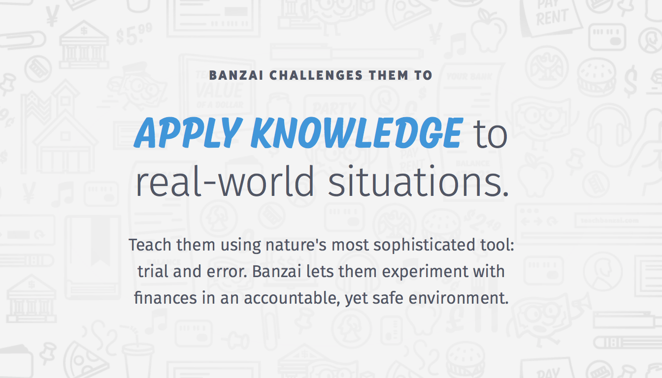
I get a lot of pleasure out of seeing Kansas Casual continue to fulfill its original design brief. Banzai still uses Kansas Casual in printed material, and launched a site redesign that uses the Semibold and Black weights in headlines and graphics.