Henrietta

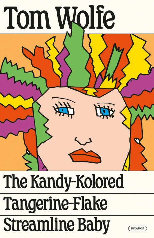
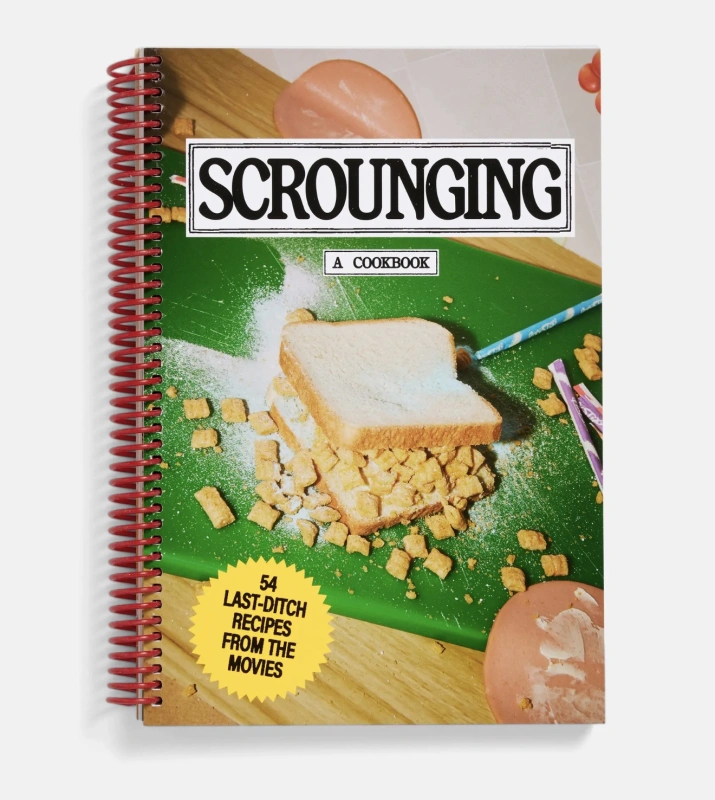
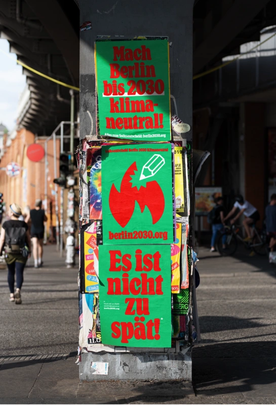
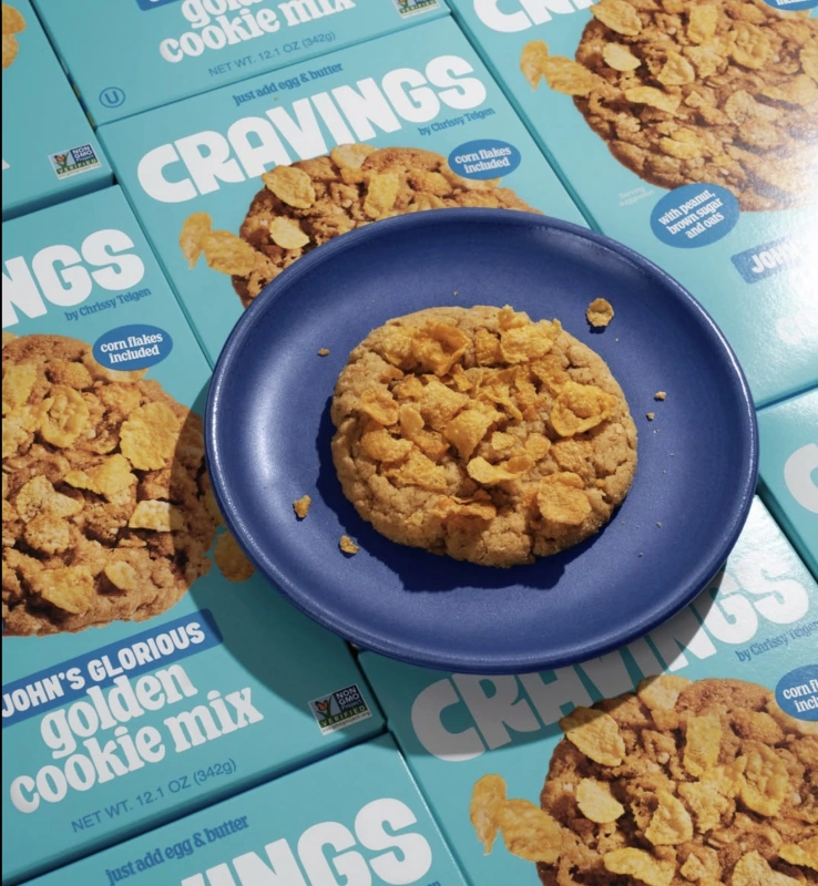
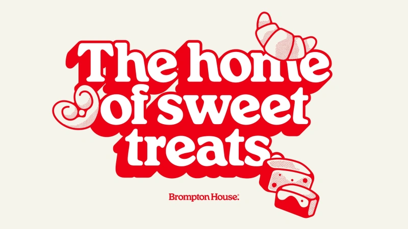
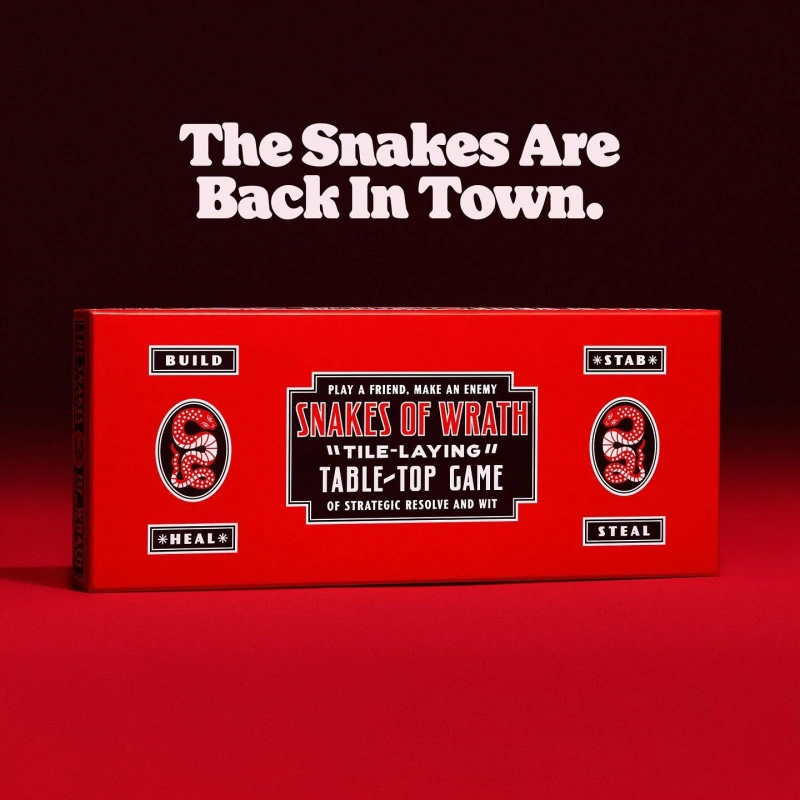
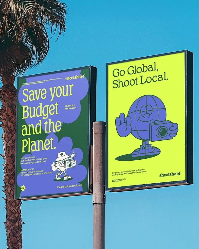
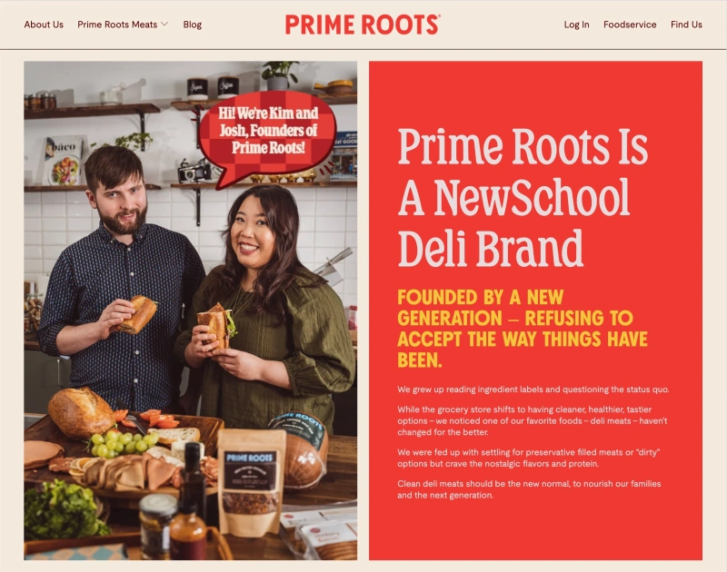
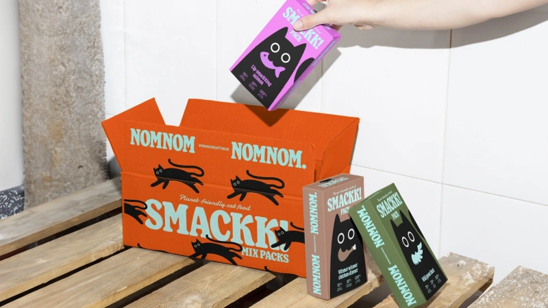
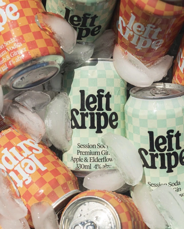
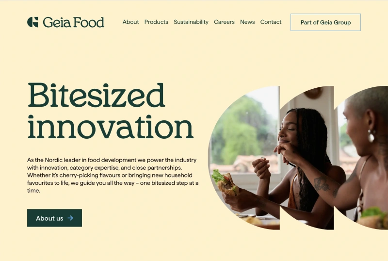
Henrietta is soft serif that was (probably) designed in the 1980s. It’s a Souvenir rip-off. But a rip-off with its own underlying logic. One with defined departures from that ubiquitous soft serif queen. It has a flatness that keeps it from being an oldstyle, a warble that feels more Art Nouveau than it does Arts and Crafts, a tall x-height, thick terminals, low contrast, with a lot of the diagonality of Windsor. I think it's really beautiful. I'm hoping by reviving it, I can learn who drew it in the first place.

Version
0.5
Released
2022
Designer
Kyle Benson
Styles
18
ss01

Detailed Q, &, $

Q&A
ss02

Straight leg n, m, h

Knifes
ss03

Half moon punctuation

True!
ss04

Upright e, P, B

Priestly
ss05

Circle tiddle

jiggly
ss06

Single story a

Sappho
ss07

Two story g

Gogol